
The pattern design of printed indoor sports wooden flooring is not a random graffiti, but needs to follow a set of scientific design principles, which not only meets the aesthetic requirements, but also does not interfere with the normal sports activities of athletes.

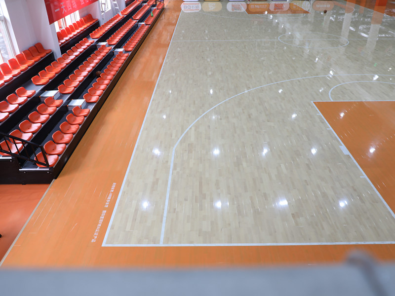
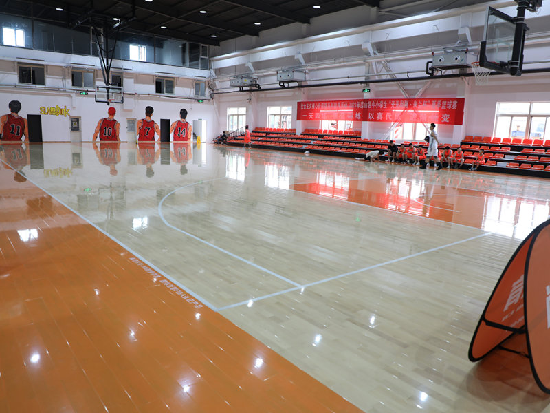
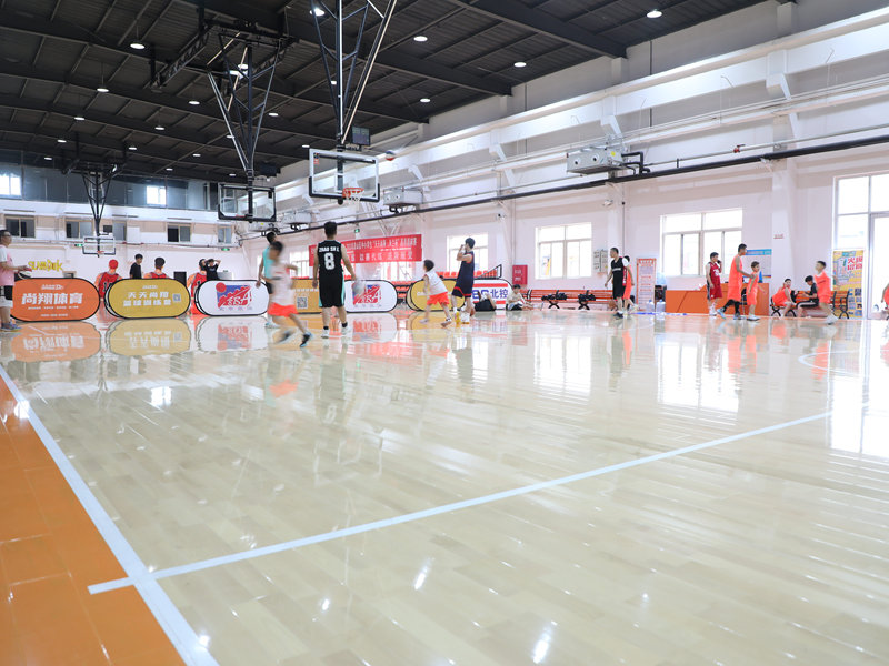
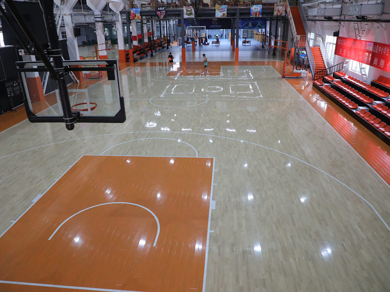
The first principle is the low visual interference principle. The core function of the sports venue is to carry out sports activities, so the pattern design on the floor must not have strong visual stimulation. The color saturation of the main pattern should not be too high, and the overly exaggerated and complex pattern design should be avoided. If the color of the floor pattern is too bright and the pattern is too complicated, it is easy to cause visual distraction of athletes during high-intensity exercise, which affects the concentration of the movement state, and even leads to misjudgment of the movement route. Therefore, the mainstream printed sports floor patterns mostly adopt the low-saturation natural wood grain tone, and the decorative patterns are designed in the edge area of the venue, which will not interfere with the central sports area.
The second principle is the movement guidance principle. The pattern design should cooperate with the movement characteristics of the corresponding sports, and play a subtle role in assisting movement guidance. For example, in the basketball court, the transition of the pattern color can be used to virtually divide the three-point line area, the restricted area and other functional areas. Athletes can quickly judge their position on the court through the subtle change of the pattern color without looking down at the obvious marking line, which helps to improve the movement efficiency. In the dance classroom, the pattern can be designed with a central symmetry structure, which helps dancers to quickly find the central axis of the movement and correct their movement posture.
The third principle is the visual comfort principle. The pattern design should consider the visual experience of long-term exercise, and avoid the visual fatigue caused by long-term viewing. The texture transition of the pattern should be natural and smooth, and there should be no abrupt color jump. The direction of the wood grain texture should be consistent with the main movement direction of the sport. For example, in the long-distance running training area, the wood grain texture can be designed to extend along the running direction, which visually gives people a sense of smooth forward, and virtually reduces the visual fatigue of long-distance running.


